Friday, 20 January 2012

Experemental

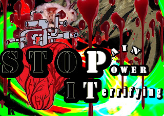
After using the cat i thought i could use part of him in another design so i took the heart out of the cat to use in a new creation (down bellow)
I then thought back to an artist Called Nevile brody who did a amazing final piece for the company Nike using a picture and diffrent styles, size and shades of fonts. So i looked at his picture (down bellow)
and inspired by this picture i decided to do something like this so opened up photoshop and made the heart as the picture. I then put the word STOP over the heart and edited the propeties of the font by changing the title so it has a drop shadow. I also thought blackening the background would be a good idea out half of the background.

Part 1
Part 2

Part 3


Tuesday, 17 January 2012

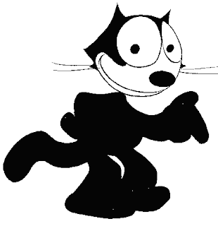
I found this image on the world wide web and i noticed it was quite amazing to look at and i really liked the way the cat is presented. The character is Felix the cat one of Walt Disneys very old characters.  i had a thought about using this and was thinking to myself i could use this in my project so i started to sketch the figure.


Using my sketch pencils i came up with this. the bandage was to show the animal being hurt but later when i scanned this into photoshop i realised i could do so much more. So i scanned this image into photoshop and went over the image in black paint brush and did the outline etc then i made the body out of scratch, i came up with this.


I then went onto Experement with this particular idea and added things into the picture that i thought resembled cruelty.


Using Google i found intresting cartoon shaped bones and organs and using this i added it into my design but in a unique way. this is what i came up with.


As you can see there is only a minor change but i have made the picture fit in more with the Design against fur as his entire ear is ripped off but in a cartoon styled way. i then decided to add to this and using google i found a cartoon heart and a few pipes and fitted them into his chest like so.


As you can see the Cartoon has now got suffering and miesery inside of him. I like this as Its another way to express cruelty but in a more immature way and not so serious as some people don't like too serious things they would just walk away etc.


I decided to write some text in to see if it would make the point more clear and understandable for the person wearing the t shirt.


When i was looking at a artist called David Carson, i liked the way he used the text fonts and sizes in his final pieces so played around with the font a tiny bit and made the bottom line of text smaller than the top so it gives a artistic effect.


Using photoshop i played around with the image properties and gave the cat a drop shadow with a blurry background, i used black as it is a colour that in media colour coordinates mystery, same as the red in the eye but red colour coordinates suffering, pain, anger and violence 

I saw a tool in Photoshop called gradient and i wondered what it did so i used it and tweaked the colours and came up with this.

Again using the same tool i repeated the pattern and got this rainbow effect.

I Decided the gradient shape i was using was to over the top so i went for a coloured square and put the gradient in and if you look to the right of the picture its a lovely little spiral of colours which also fills the background with colours from the spiral which i think gives a brilliant effect of bright colour and light to the picture.

Friday, 6 January 2012

Development ideas

When i was looking for a picture for cruelty i was thinking maybe i could just use a normal image and expand it so i went onto google and found a image of a cat (picture bellow)


i was thinking i could use this in my work quite well as it is very well produced, being the way the cat is shaped and the way the eyes are really eye catching, so i went back onto the internet and found this unusual design.


I really liked it so inspired by this particular piece i decided to take the eye and the idea of another story going on in the background into a water coloured sketch/ drawing. I then cut it up into a weird sort of shape as i was going to have this as my final piece 
 i then decided actrally i could experement with this so i used the scanner and scanned it into photoshop and taking the image of the cat i added the image to the cat and added a sauration of a blue tint to the cat so it matched my picture. After that I decided i wanted to make it more creative so i went over the cat and a few other of the drawings on the image in photoshop with the paint tool just to give it a clearer and better out line. 


I then thought to myself about the motto i saw in one of the last years winners of this campaign which was 'Know What Your Paying Fur' i really liked this motto so i used it in my own work this is what i came up with 


Inspired By David Carson and Nevile Brody I changed the font sizes and put them in random places to give i a effect. I then Coloured in the No and Fur in the motto 'Do you know what your paying fur' so it stands out and if it was on a t shirt it would be easy to see the main idea of the t shirt.


i then did some experimental work  with my design so i tried using photoshop and i thresholded it, i like it as i think it looks quite unusual but i dislike the way the black and white is the only colours on the image asi thought it is too bland 

Developing on from this idea i wrote out some text that links in with animal cruelty on a a4 piece of paper on photoshop. I then changed the colour of the writing to white and background black like this:

Inspired by the style of Nevile Brody i made this piece. all i have done was made the font different sizes. I then added my design into the picture and shaded some of the areas around the design so it fits in with the black, i also changed the opacity settings so the writing really stands out more than the picture. This is what i came up with.


I then thought of using a different colour cat to show more of a effect of violence and to emphasise my point of cruelty. So i went onto photoshop again and opened the image above and changed the hue and saturation to a more suitable outcome.

I like this one more as it looks more to the point of cruelty and you can see a artist effect in  what's surpose to be a serious and horrific thing to talk about in a poster or on a shirt.

I then experimented with the picture more and i flattened the image using photoshop and rasterized the text then i used the magic wand and deleted the colour inside the text so the picture goes through as the text this is what i came up with 


I love the way the word cruel came out it really shows violence and character to the setting of animal cruelty as it has the blood and the slashes in it which emphasise pain and suffering for animals.

I Lastly tried to use some of the techniques around photoshop and in the end i used stained glass 

I like it as it looks really funky and artistic however some of the words you cant see very well because of it, so if i was to use it again i would want to Make sure i space the letters out and make them big enough so they can take this effect